Nutrition Value in McDonald's Food
How many calories does the average McDonald's value meal contain? How much do beverages, like soda or coffee, contribute to the overall caloric intake? Does the salads we eat really healthy as they look ? So here I want to analyse the various categories Mc Donald’s offers,and its Menu items and their nutritional values.
The dataset I use provides a nutrition analysis of every menu item on the US McDonald's menu, including breakfast, beef burgers, chicken and fish sandwiches, fries, salads, soda, coffee and tea, milkshakes, and desserts.

World Income Map
The map shows the world income level of different countries. World development indicators as Latest Population Census, Latest Agriculture Census of each country are also included in the map. Python code can be found here.

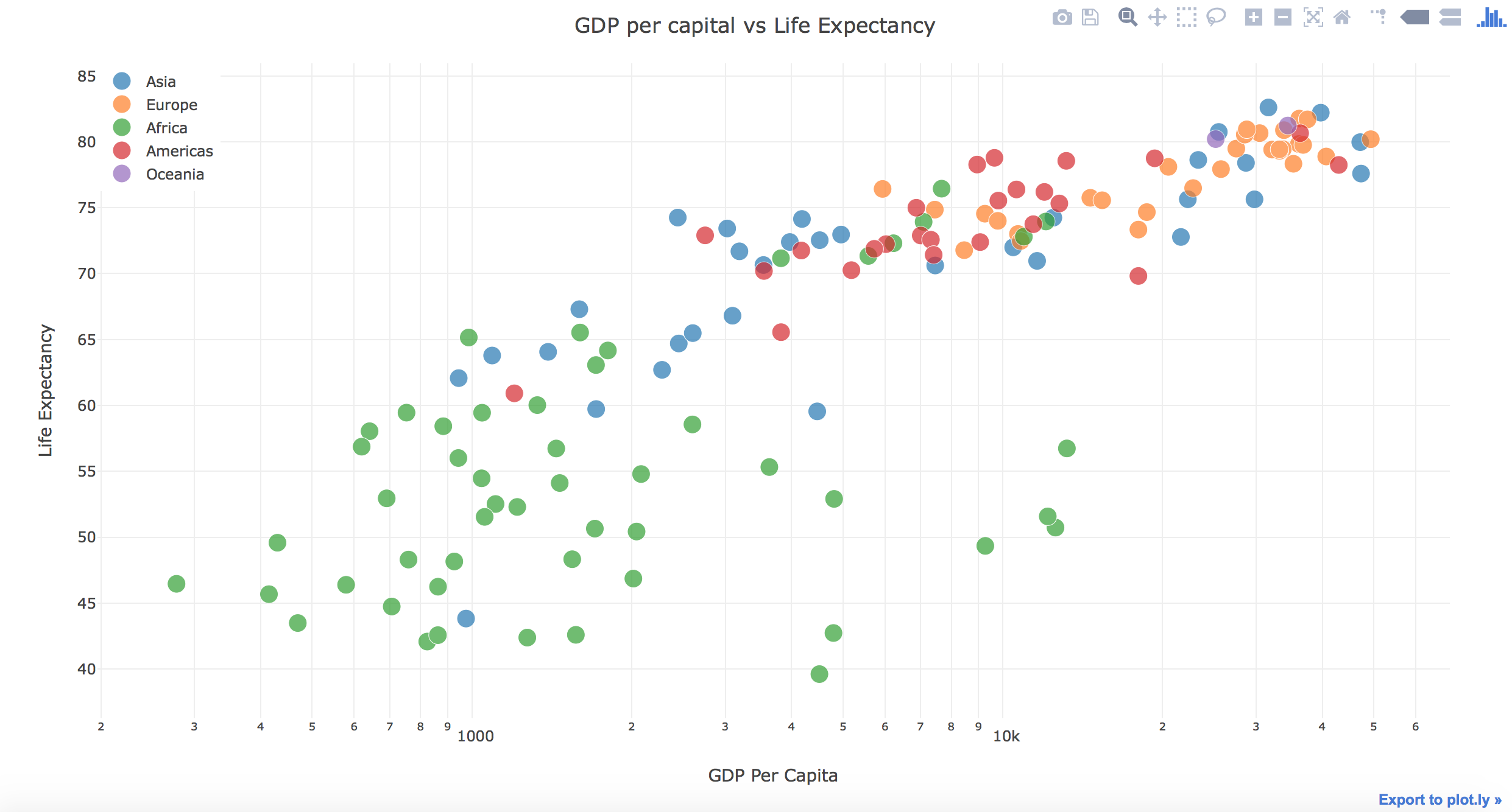
GDP and Life Expectancy around the World
This is a Scatter plot made by Plotly showing the relationship between GDP per capita and life expectancy around different countries in the world.You can choose the continent to display and see the differences between countries in one continent and also the differences between different continents. Python code and data resource can be found here.
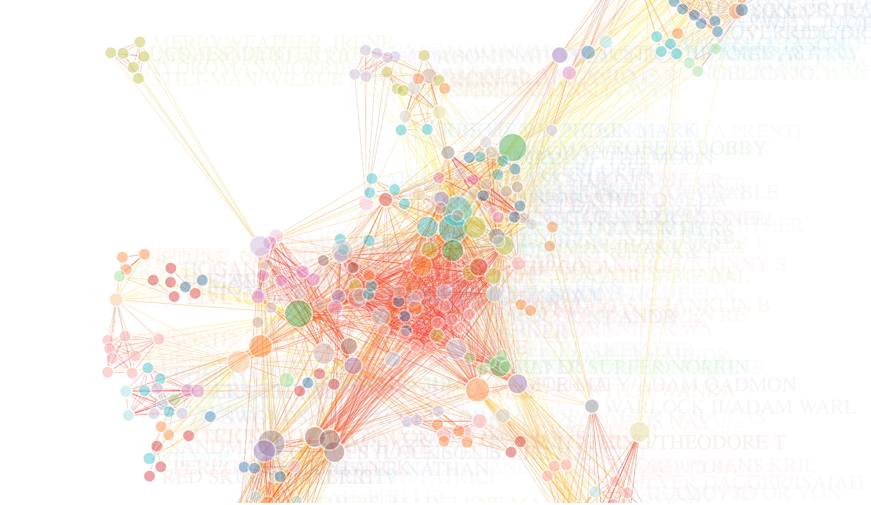
Network of IMDB Top 500 Actors
This is the network of IMDB Top 500 Actors. The visualzation is made by Gephi. Gephi file and data resource can be found here.


US Agricultural Exports
This is a tableau visualization showing the US agricultural exports data.Dataset can be found here.

World Temperature Map
Some say climate change is the biggest threat of our age while others say it’s a myth based on dodgy science. Use the world temperature map>, you can see the temperature of most of the countries in the world and major cities' average temperature over the past years. You can choose each years' map and can choose which country to display. Data can be found here

The 500 Greatest Albums of All Time
Based on The 500 Greatest Albums of All Time data provided by Rolling stone, I use bokeh to draw a chart of the top 5 rock artists. Data and code can be found here.

US Cancer Rate
Leaflet is one of the most popular source JavaScript libraries for interactive maps. Here I use the Leaflet package in R to show a map of US cancer rate, including the overall cancer rate, and the breast cancer rate of 2016.
Datasets and R code can be found here.
